
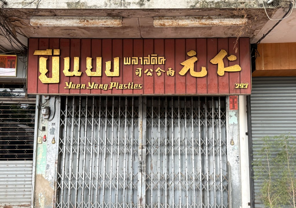
This is another great example of how fusion plays out in Bangkok’s store signage mixing three completely different typefaces for each language. It might look a bit chaotic at first, but there’s an aesthetic charm to it. I particularly love the Thai script, it’s beautifully designed, almost like stacked blocks. Bold, unique, and unmistakably Bangkok.

Leave a comment