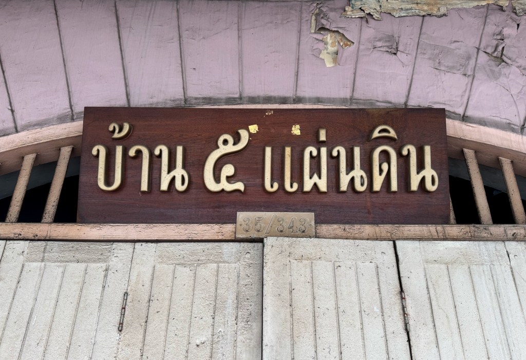
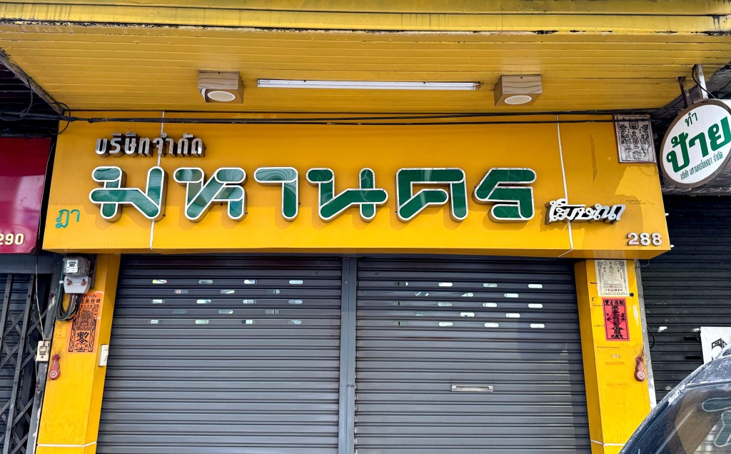
This store signboard likely belonged to a restaurant that may no longer be in business, but what a beautiful piece it is. The teak wood gives it such warmth, paired with elegant Thai typography. And what an interesting name for an eatery too. A lovely relic of the past.
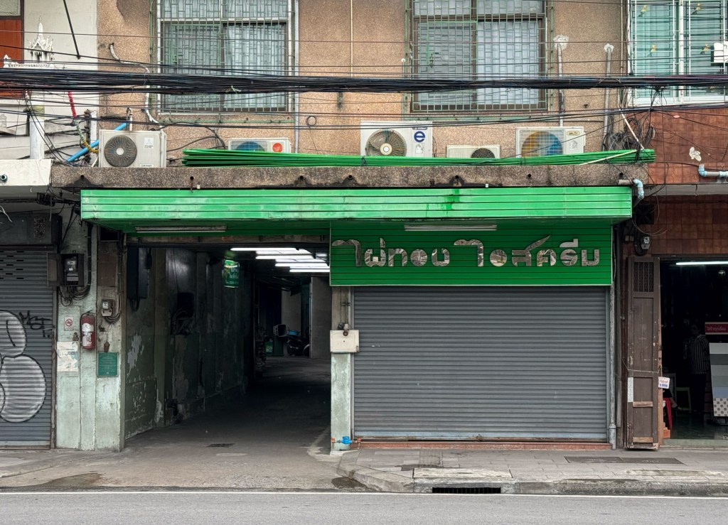
Another cool shop sign I stumbled across, though I couldn’t quite tell what the business was at first glance. Turns out, it’s an ice cream shop (wish it was open when I walked by!). The Thai typography really stands out from the usual shop signs, such a bold and unique design!
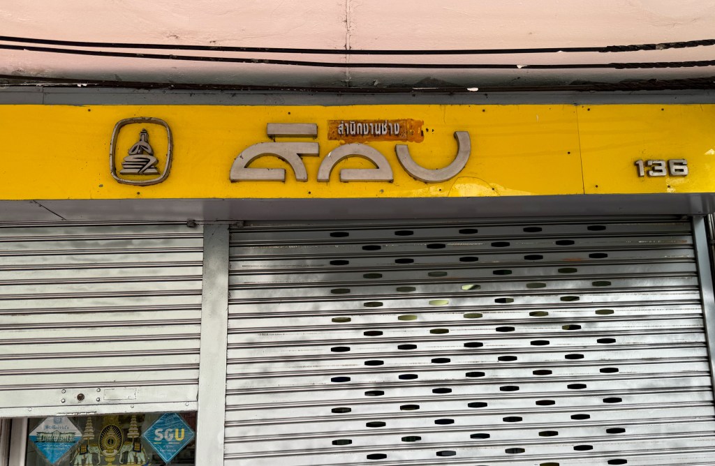
I have no idea what this business is about—but I was completely fascinated by their logotype. What a cool way to design Thai script! If you know what this place is, drop me a comment. I’d really appreciate it.
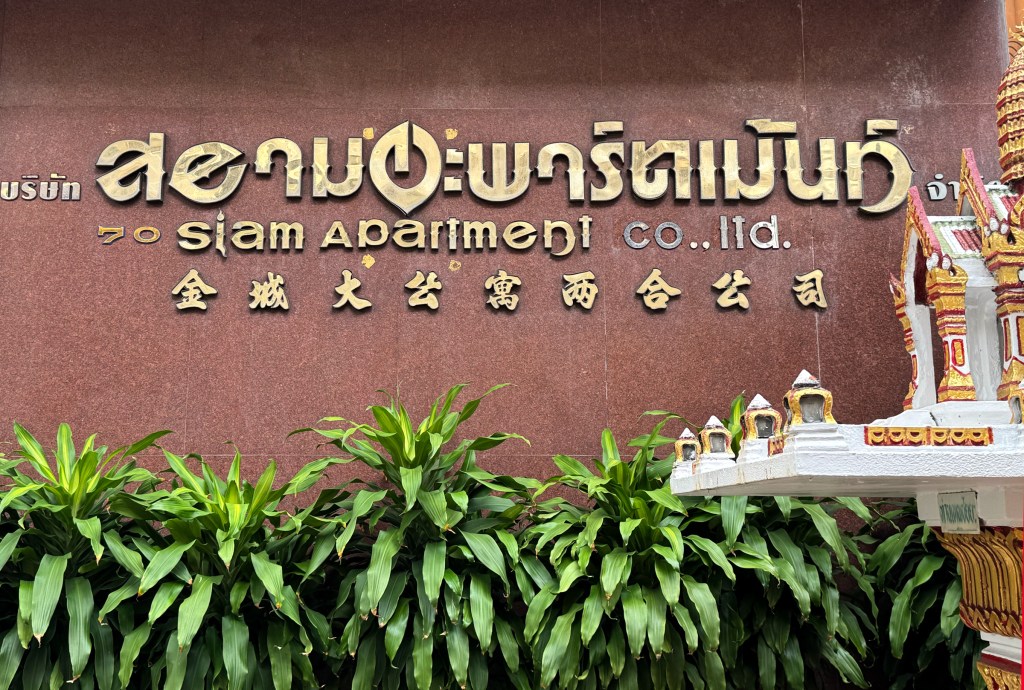
This has to be one of the most dramatic Thai typographies I’ve seen in ages. Just look at it so futuristic and bold. As signage for an apartment building, it’s unexpectedly cool and full of character.
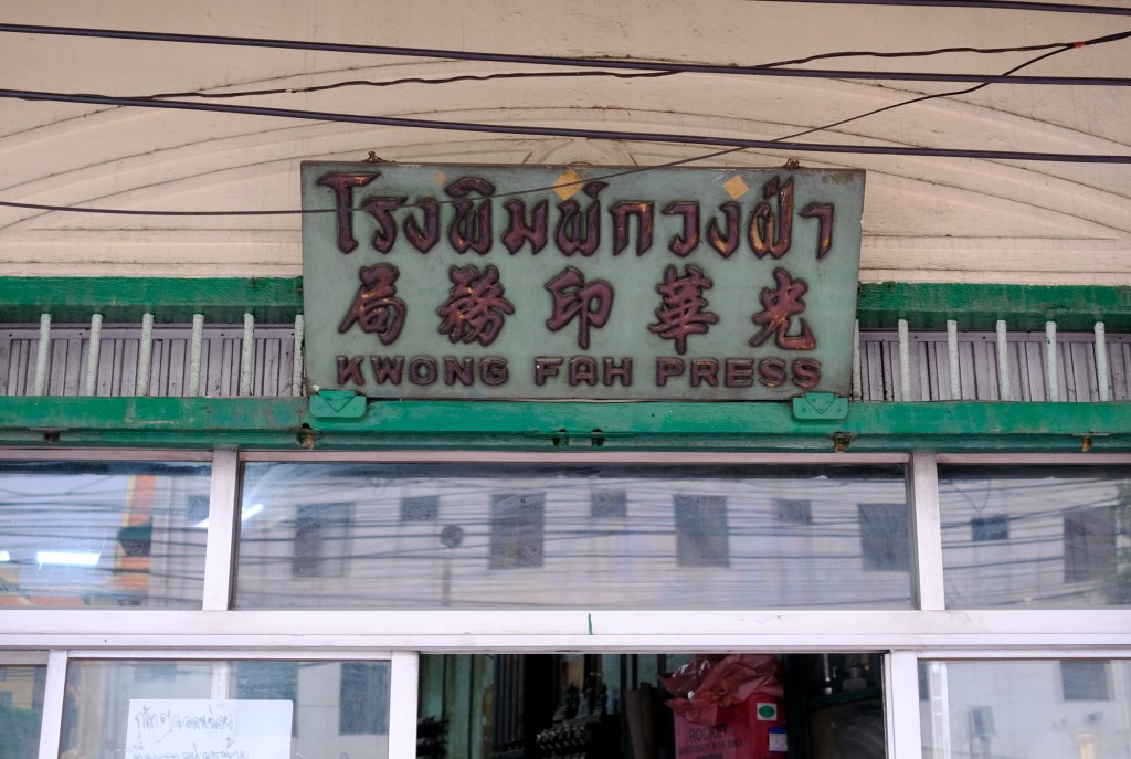
Here comes another vintage piece from Yaowarat belong to a printing shop this classic wooden signboard featuring Thai, Chinese, and English. I assume it was once a vibrant mix of green and red, now softened by time. Still, it remains a timeless piece with beautifully crafted typography in all three languages.
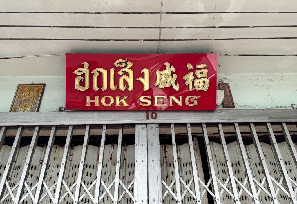
I’m not entirely sure what this shop sells, but since it’s located in a soi full of steel and auto-parts stores, I’d guess it’s one of them. But hey, we’re here to talk about signage not shop functions anyway right! This is a classic example of Bangkok’s store signs: bold red and gold, a favorite color combo in Thai-Chinese culture. Festive, eye-catching, and full of personality. The shiny PVC board paired with metallic fonts gives it an extra punch. I also love how the Thai, Chinese, and English typefaces are all san-serif styled and blend together so well.
This is another great example of how fusion plays out in Bangkok’s store signage mixing three completely different typefaces for each language. It might look a bit chaotic at first, but there’s an aesthetic charm to it. I particularly love the Thai script, it’s beautifully designed, almost like stacked blocks. Bold, unique, and unmistakably Bangkok.
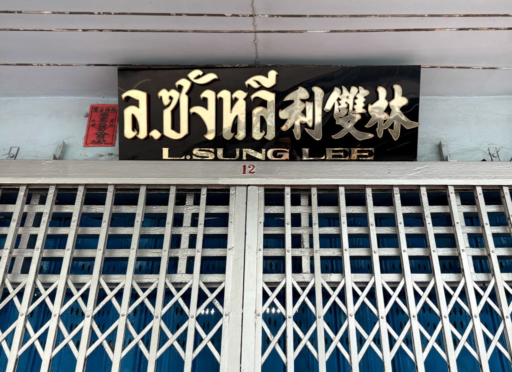
L. Sung Lee is a store that sells cart and stroller wheels. What I love about this signage is its simplicity especially the black and silver color combination. The shiny metal typography, presented in three languages, is neatly condensed onto a small black PVC board. Dark and silver, minimal but effective, it just works.
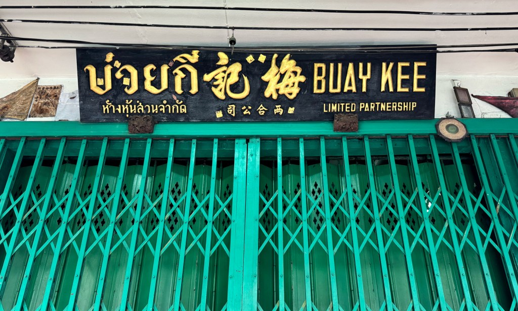
Buay Kee is a steel supply company located in Chinatown. What’s interesting about this shop is that they actually have two branches just a short distance apart, each with a slightly different signage style. The one pictured here is likely the older branch, featuring a classic Chinatown aesthetic: dark black wood paired with beautiful golden Thai and Chinese calligraphy. It’s traditional and elegant.
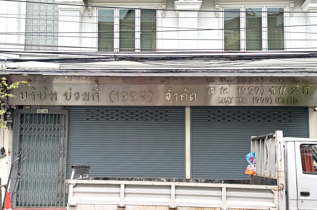
The other branch, however, has a much more modern look, almost a contemporary design. The signage is simple but striking, clearly communicating that this is a steel business, while showing how a brand can evolve visually over time.
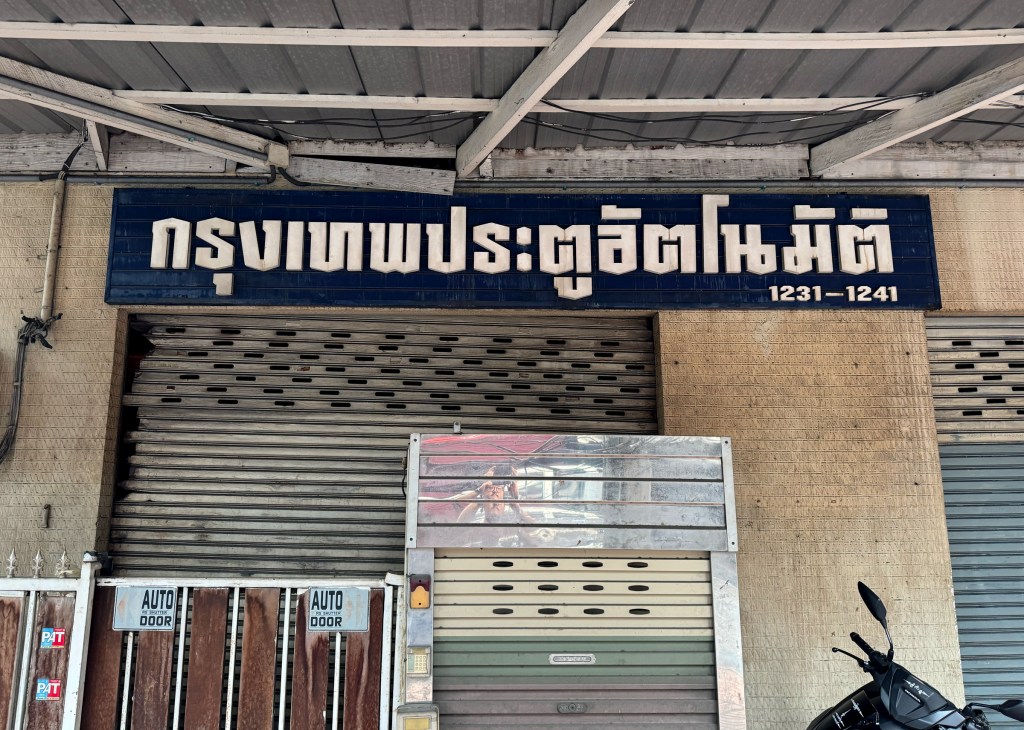
Sorry, I couldn’t catch the exact name of this shop, but from what I can gather, it’s a place that sells automatic doors. The signage reads “Bangkok Auto-door” correct me if I’m wrong (and if you can read Thai, I’ll blame Google Translate if it got it wrong 😅).
But what really caught my eye is the bold and sturdy Thai font. It’s strong, with sharp curves and beautifully balanced proportions. Set entirely in white against a deep blue background, It really stands out.
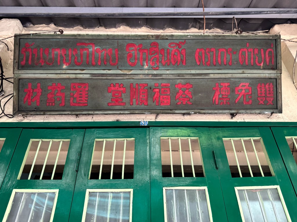
Another hand painted vintage piece that instantly brings you back in time. I found this Thai-Chinese herbal medicine shop tucked away in a small soi, surrounded by jewelry stores. The signage is written in both Thai and Chinese, and from the Chinese characters, you get a hint of what the shop is about.
What makes this sign truly unique isn’t just the handwritten typography, it’s the layout. In the center is the shop’s name (蔡福顺堂), on the right is “Double Rabbit” trademark, and on the left, it says “Siam Herb Medicine.” All three sections are equally spaced, almost making it feel more like an old-school advertisement board than a typical store sign.
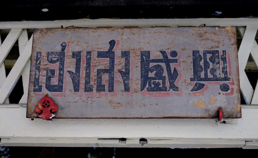
How can we talk about signage without mentioning the creators behind them? In one of the small soi (alley in Thai) near the big roundabout in Chinatown, you’ll find several signage shops, places that design and make shop signs, lightboxes, and all kinds of advertising materials. This particular one really stood out to me. I couldn’t even catch the shop’s name because the Thai script was just too creative! It’s so stunning and unique. it felt more like a piece of graphic art than just a sign.
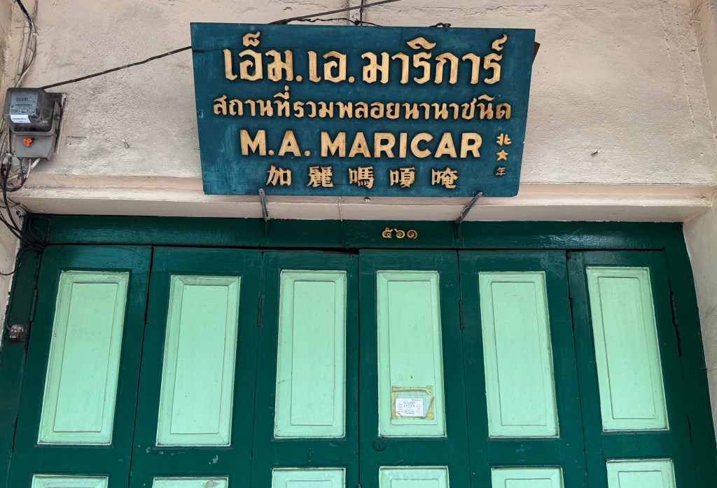
Honestly, there aren’t many store signs in Chinatown that use dark green, so this one really caught my eye. Paired with the beautiful green door, it just looks great. Along this small soi, you’ll find many gemstone and jewelry shops, most of them much smaller compared to those on Charoen Krung. This particular store sign features Thai, English, and Chinese, with beautiful gold script on a dark green wooden board. A simple yet striking piece.
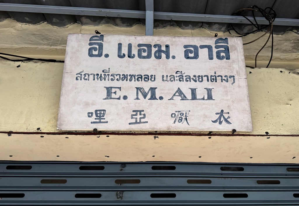
I’ve seen many handmade signages around Bangkok, but this one is particularly interesting. Why? Because it’s a diamond in the rough. It’s so tiny and understated, especially for a flashy jewelry shop. Would you even guess it’s a jewelry store just by looking at this sign? Probably not.
What makes it stand out is that it’s 100% hand-painted, with a mix of different typographic styles all packed into one small canvas. As a Chinese speaker, I can’t even identify one of the characters (the second one from right to left) but that mystery, combined with the handwritten touch, makes this sign all the more fascinating.
Wow—what a vintage gem, both the shop and its signage. Heng Seng specializes in handmade Chinese prayer cushions for ceremonial use, a rare tradition that’s hard to come by these days. Their story is just as fascinating as their craft. I’ve included an article from the Bangkok Post and a link to their products if you’re interested. But if you’re ever in Talat Noi, do stop by. Just like the sign itself, everything in the shop feels like a journey back in time.
I absolutely love this signage, the Chinese characters reflect the aesthetics of 1930s–40s China, and even the Thai script beautifully complements the overall style. Truly a stunning piece of heritage. If you’re interested in the story behind this shop.
Another day, another stroll through Chinatown. Every walk along Yaowarat feels like a treasure hunt. This time, what caught my eye was the Thai typography on this storefront, an unusual, tall and slim typeface in gold, set against a deep black wooden background. Absolutely stunning.
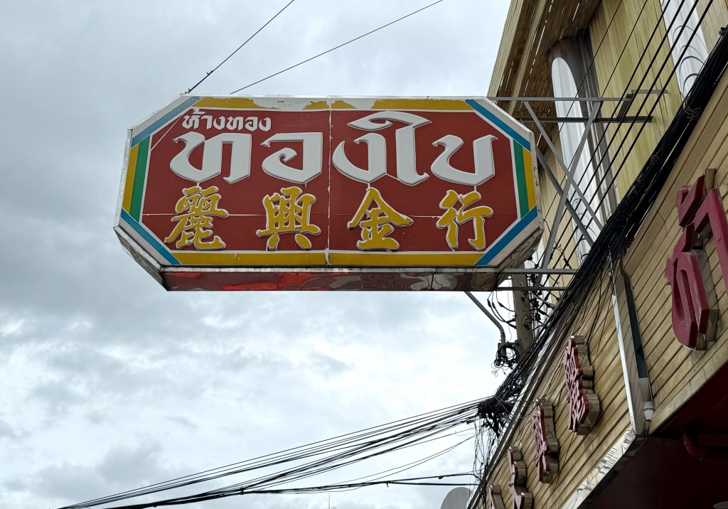
This is a lightbox for a gold shop in Chinatown. I’ve noticed that many gold shops in Bangkok tend to use bold colors like red, yellow, green, and blue in their signage. For this particular sign, the shop name is displayed in a very bulky Thai font alongside Chinese characters. Interestingly, each language is presented in a different color, with a colorful border wrapping around the lightbox, creating a vibrant visual tension that grabs your attention.
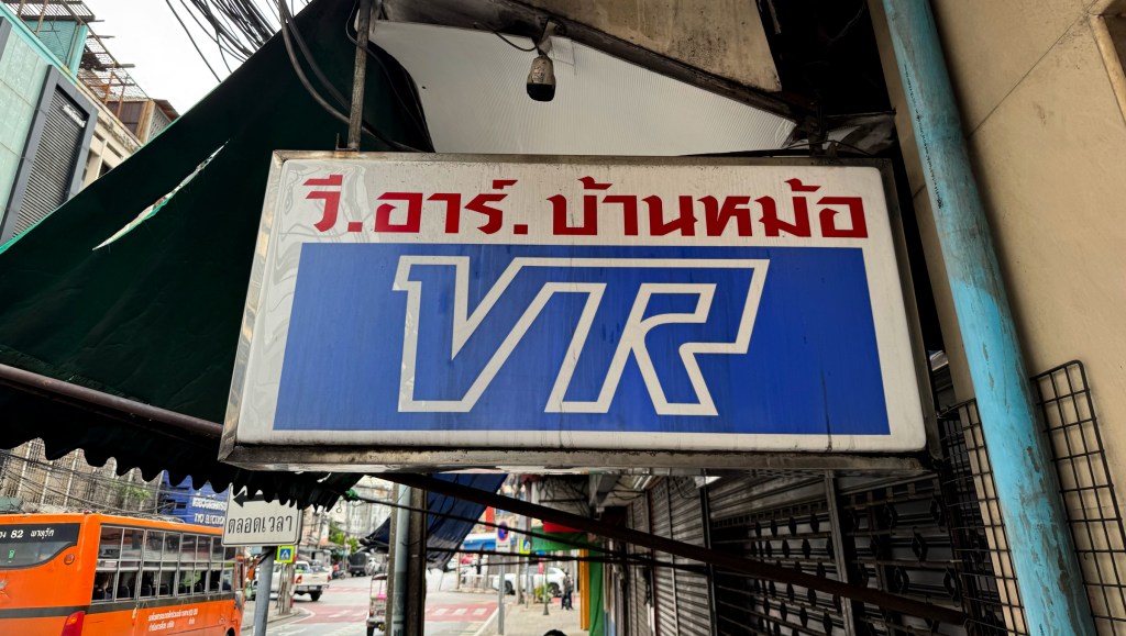
This lightbox belongs to a radio and speaker equipment shop in Chinatown. While the design is simple, I really appreciate the clean and well-crafted store logo “VR,” paired with the Thai script store name above it. A neat and balanced composition that stands out quietly.
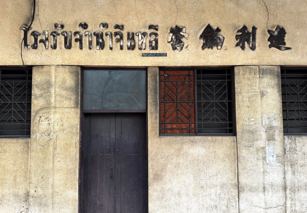
Found this abandoned pawn shop tucked in a corner of Yaowarat Road. The store signage is engraved directly into the cement, once painted black but now beautifully faded with age. Thai and Chinese names sit side by side in perfect harmony, creating a quiet yet captivating visual balance.
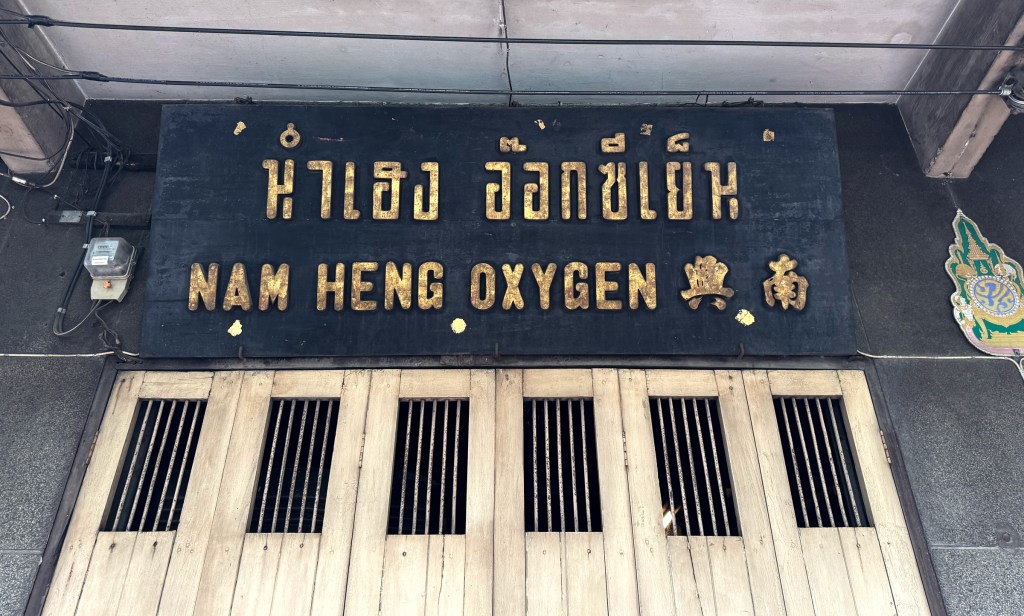
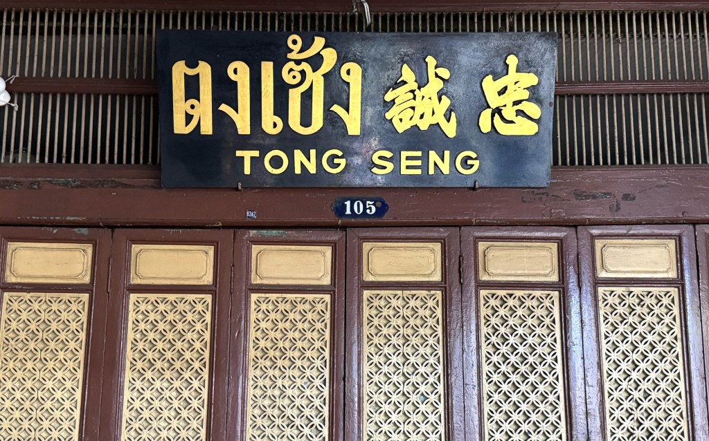
Another classic shop sign from Chinatown—a black wooden board with gold, gleaming letters. What stands out is its simplicity and the bold choice to mix different type styles. Unlike most shops that aim for consistency, this one embraces contrast, featuring three distinct fonts for Thai, Chinese, and English.