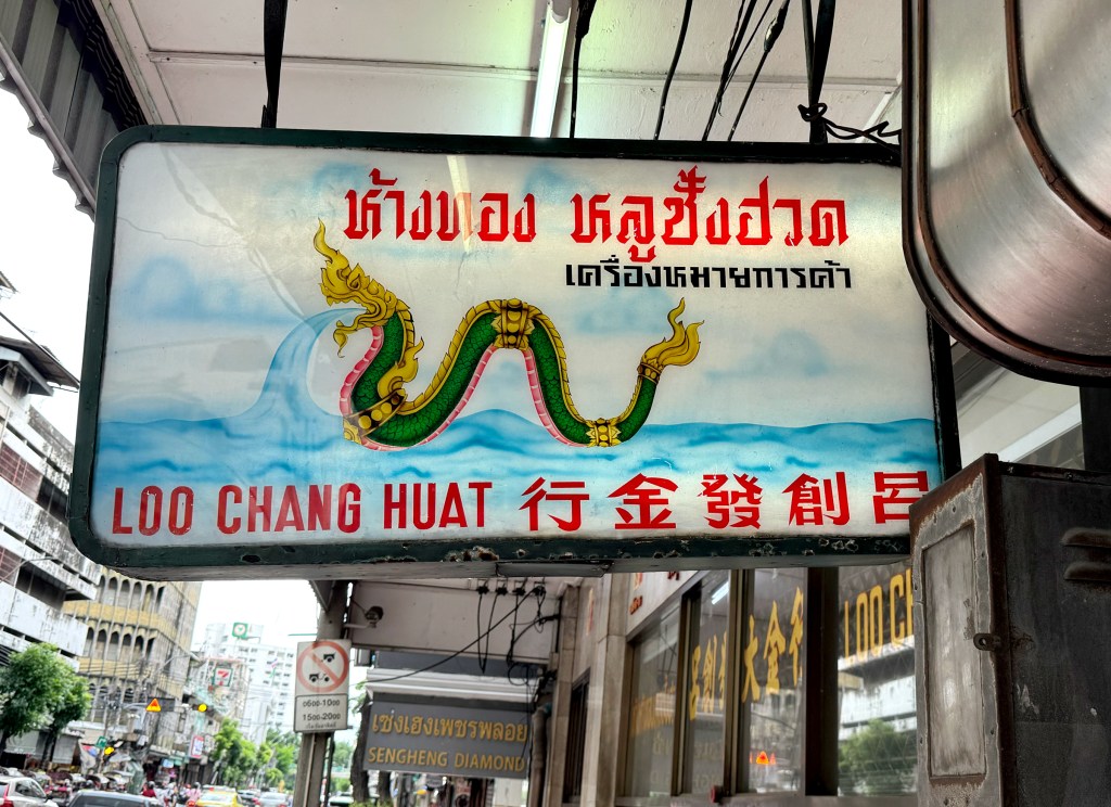
This gold shop’s lightbox features a green Naga, mythical serpent-like beings revered in Thai culture as protectors associated with water, fertility, and Buddhism. It appears to serve as the shop’s unique trademark. The typography in Thai, Chinese, and English is also thoughtfully paired, creating a balanced and eye-catching design.
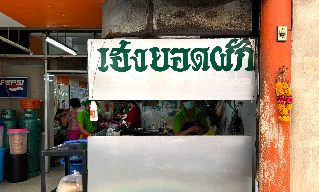
Rad Na (or Lad Na) is a Thai dish featuring wide rice noodles drenched in a rich, savory pork gravy. This Chinatown restaurant specializes in it, and the Thai script on the sign is both playful and unique. Though it’s simply a green sticker, placed against the shiny metal surface, it creates a surprisingly striking visual impression.
Location:
673 Phiraphong Rd, Wang Burapha Phirom, Phra Nakhon, Bangkok 10200
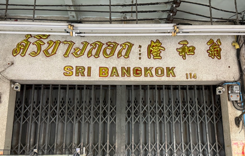
What a cool name for this shop, Sri Bangkok, which literally translates to “Glory Bangkok.” Like many signs in Chinatown, the storefront features Thai, English, and Chinese scripts. The fonts themselves may not be extraordinary, but the shine of the signage truly lives up to its name. A glorious piece indeed.
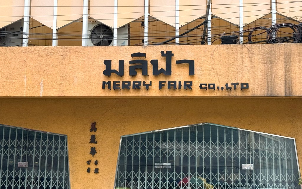
I honestly have no idea what this company does, but I really admire the customized Thai and English fonts. They feel like pixel art embedded into a clay-textured concrete wall, such a unique and creative installation.
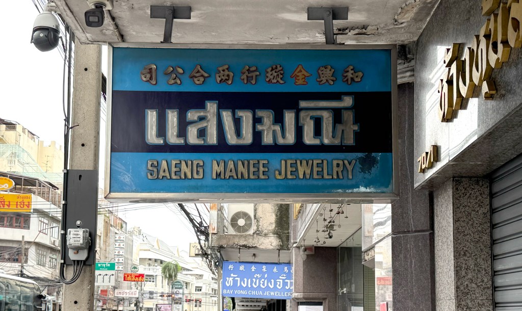
I’ve always been a big fan of blue tones and bold black fonts. This lightbox from Saeng Manee Jewelry really caught my eye, what a beautiful Thai typeface outlined in light blue against a deep blue background. Truly a stunning piece of signage.
Location:
70/1 Phahurat Rd, Wang Burapha Phirom, Phra Nakhon, Bangkok 10200
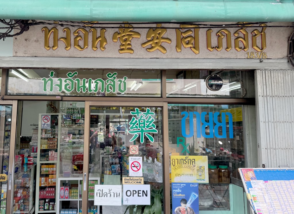
This is a simple pharmacy sign in Ratchathewi, featuring only Thai and Chinese. The bulky, bold typography in both languages gives it a classic and timeless look.
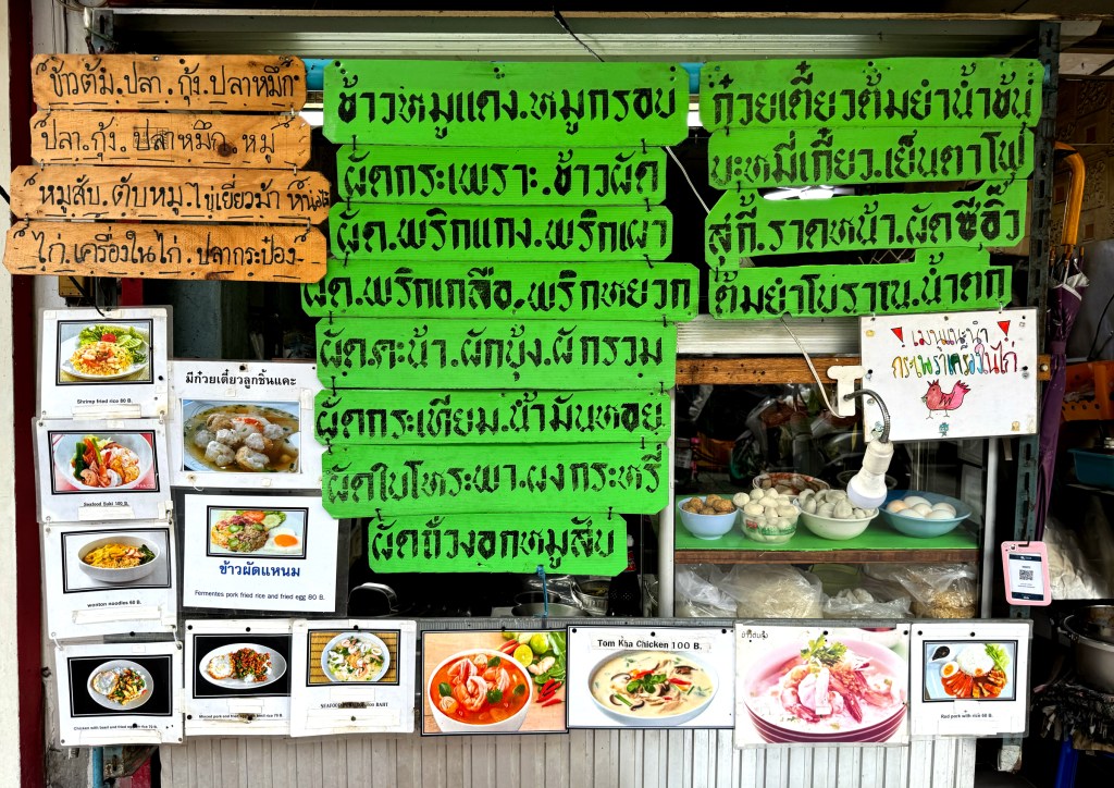
I’m really fascinated by this tiny food stand in Ratchathewi. A collage of various menus covers the stall, creating a striking visual mix. The handwritten fonts on the small wooden boards and green sign add a charming, personal touch. And if you look closely, there’s a little chicken illustration in the corner, colorful, playful, and absolutely delightful.
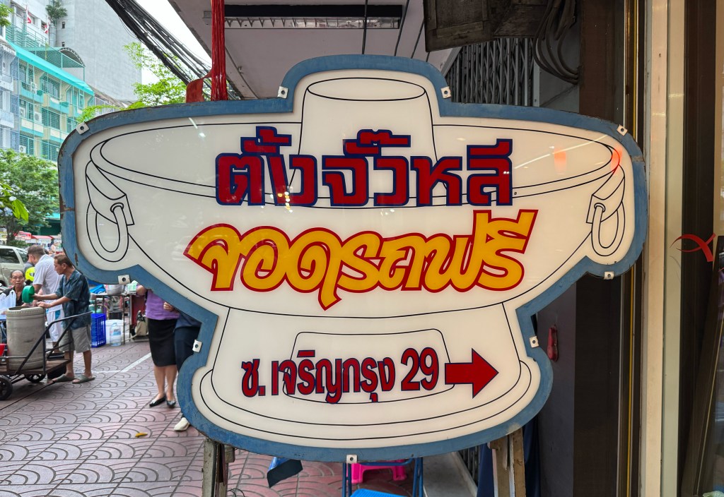
What a unique lightbox, shaped like a traditional Chinese hotpot! This Thai-Chinese restaurant, tucked away in Chinatown, features two distinct Thai typefaces on the sign: one for the restaurant’s name and another for the bold yellow “Free Parking” message. It’s eye-catching and full of character, hard to miss as you walk by.
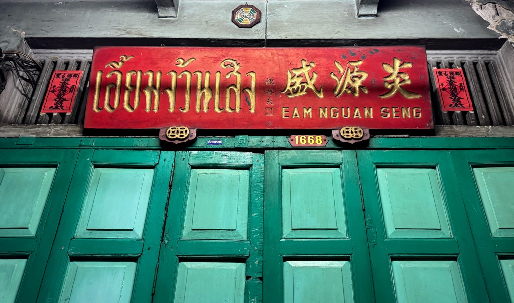
What a stunning visual treat on Song Wat Road, a deep red woodboard with beautifully engraved gold lettering. Unlike most signboards in Chinatown where fonts are typically mounted on the surface, this one is carved directly into the wood with precision. The contrast against the turquoise green doors makes it even more eye-catching. A true gem!
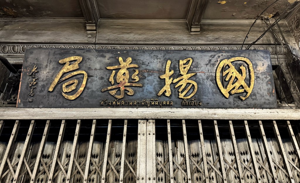
This signboard is truly an antique gem, found in the heart of Chinatown. Unlike most shops that use standard Chinese typefaces, this pharmacy sign features beautifully hand-painted Chinese calligraphy, elegant, flowing, and full of character. The small Thai script beneath adds a subtle local touch, but without it, you’d easily mistake this for a signboard straight out of 1940s or ’50s China.
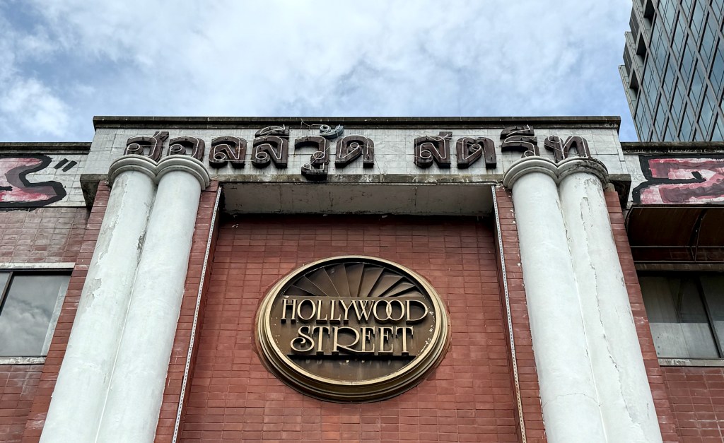
First of all, it’s not a street—it’s actually a building complex that used to be filled with music stores, bars, and various shops. These days, it’s a bit run down, but still holds a lot of charm. What really caught my eye was the signage: a beautiful Art Deco-style English font on the red brick wall, paired with a bold Thai script on the main facade. A striking mix of character and nostalgia.
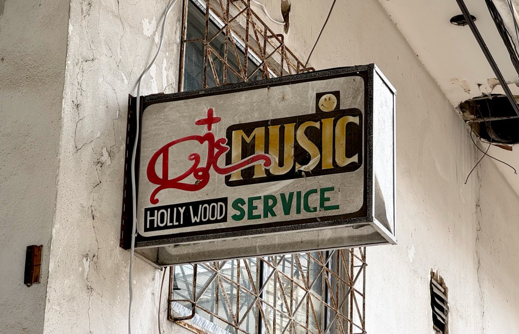
Tucked behind the building, this hand-painted light box quietly shines.
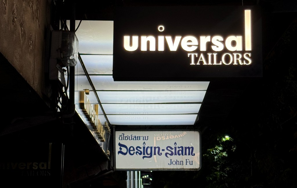
What a nice combo I found on Silom Road! I especially loved the lightbox from Design-Siam John Fu, a tailor shop tucked among many others in the area. This one really stood out, the font is such a joy to look at, with its playful, dancing script. I’m not quite sure why there’s a flame in the logo for a tailor shop, but it definitely adds to the charm.
Location:
252/1 Si Lom Rd, Suriya Wong, Bang Rak, Bangkok 10500
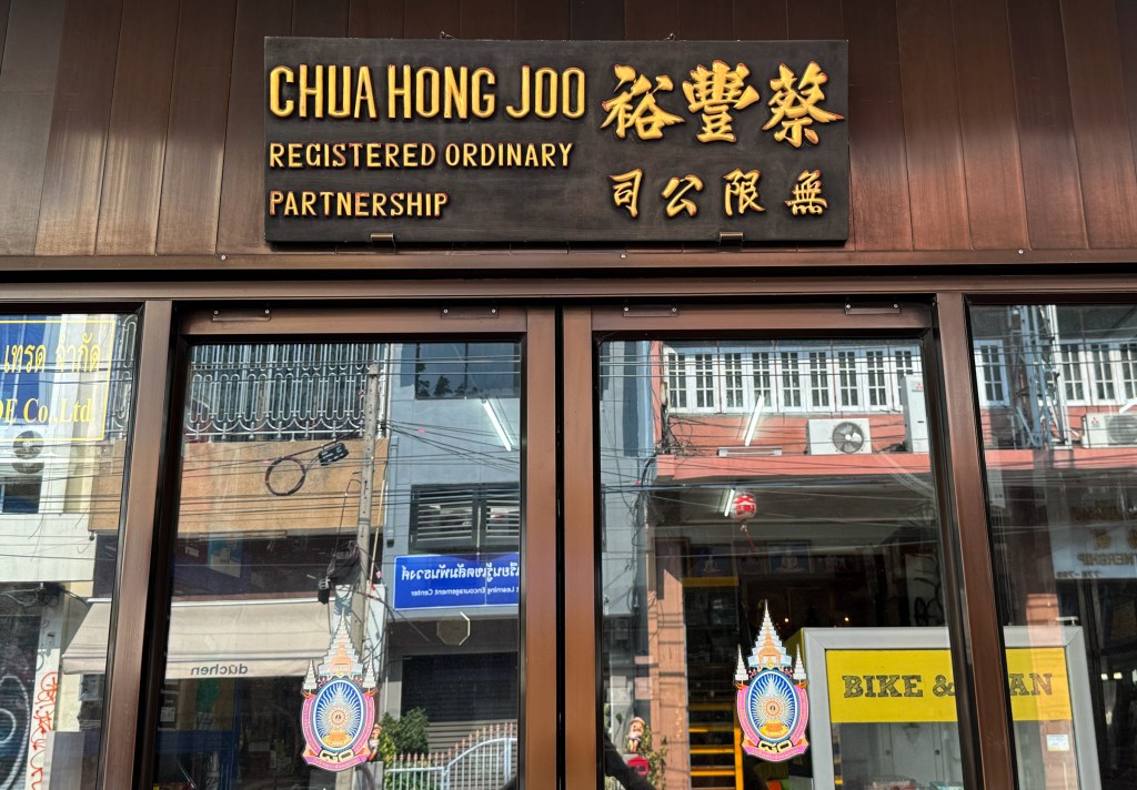
Back in Chinatown again—one of my favorite places to wander in Bangkok. With so many old shophouses and restaurants, it really feels like stepping back in time. It’s truly one of the most unique spots in Thailand. This classic wooden signboard features only English and Chinese, with beautiful gold Chinese calligraphy that stands out perfectly.
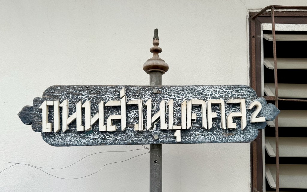
This is the road sign for Soi 2 Nom Chit — a beautiful vintage piece made with handmade wooden Thai letters. From afar, it almost looks like Russian Cyrillic because the font has no curves at all, just stacked wooden strips. It really reminds me of the Soviet-era typeface ST-Agitaciya — bold, blocky, and full of character.
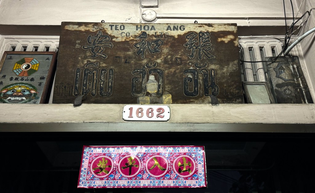
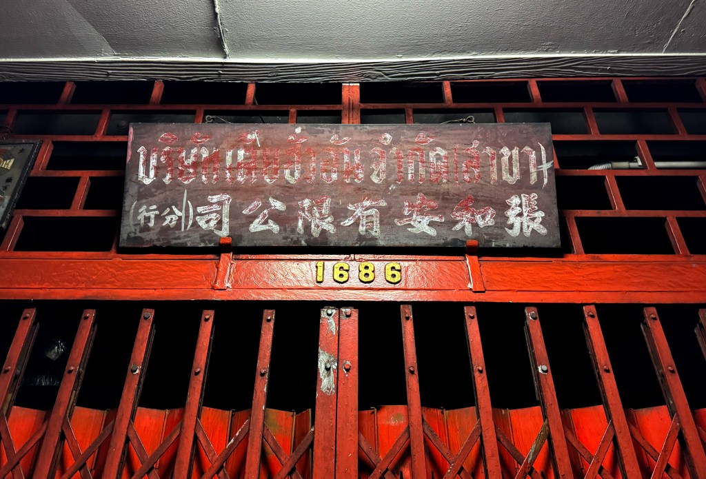
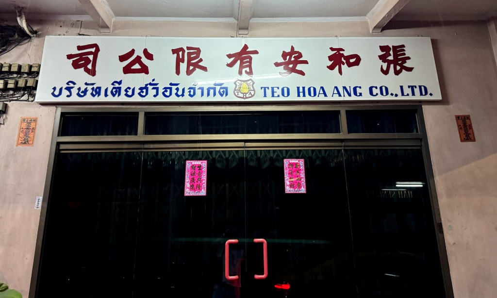
What an ancient signboard I stumbled upon in Chinatown! Teo Hoa Ang is a trading company on Song Wat Road — one of the trendiest streets in the area right now. Judging by the design, font, and overall look, this sign must be over 70 years old, maybe even more. I’m no antiques expert, but this one definitely feels like a rare piece straight from the past.
This is the signboard for its branch company, located in the same street — same name, just with “branch” added next to it.
A more modern signboard featuring the company name in Chinese, Thai, and English, with a logo placed right in the center.
Location:
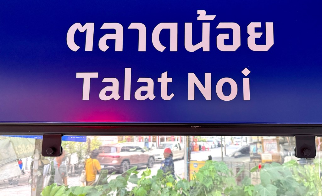
1658-1662 Song Wat Rd, Talat Noi, Samphan Thawong, Bangkok 10100
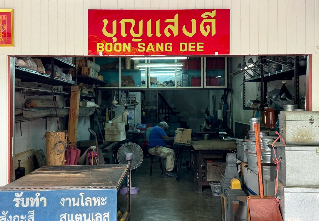
Boon Sang Dee is a small shop selling tin buckets, pipes, and other bits and pieces I can’t quite name. The shop sign is a small red acrylic board with bold yellow Thai and English letters — simple, but it really stands out against the plain white wall.
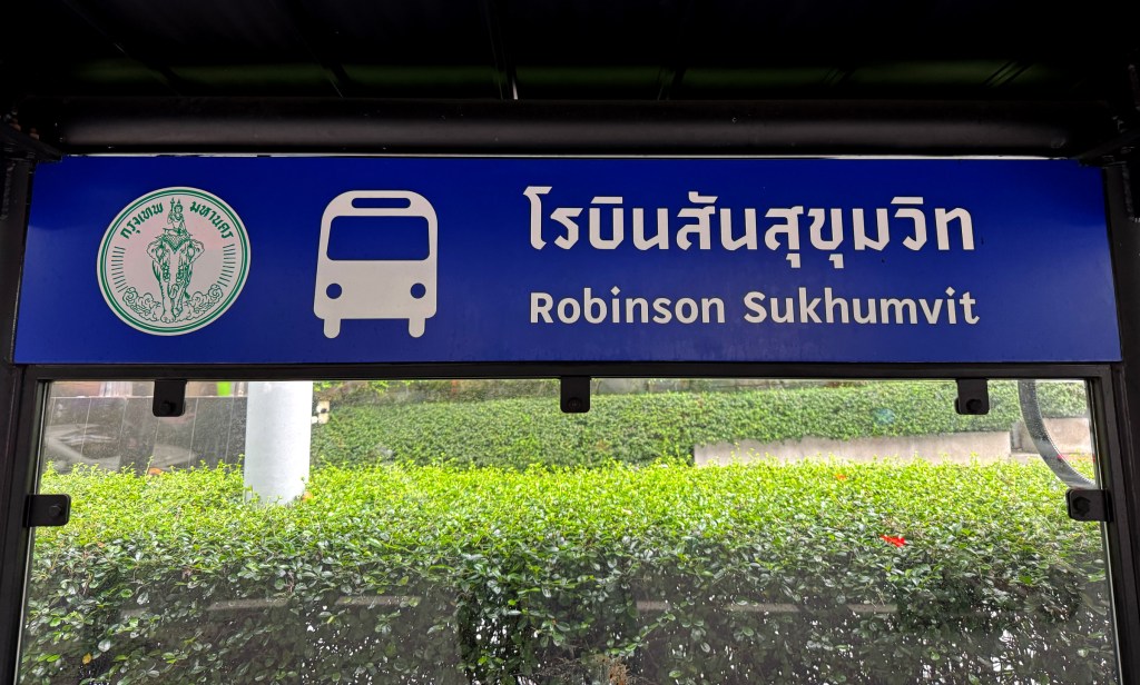
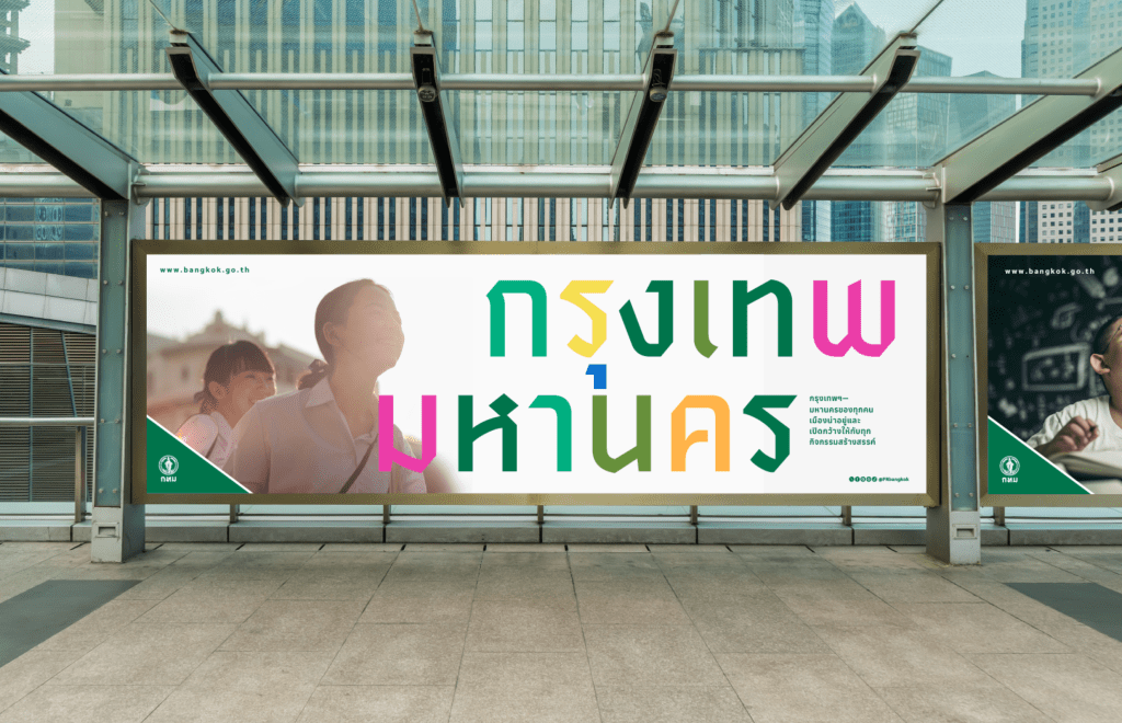
If you’ve been strolling around Bangkok lately, you might’ve noticed a lot of new bus stop stands and city posters. They feature a beautiful modern sans-serif typeface in both Thai and English. It’s calledSao Chingcha, designed by Farmgroup (a creative agency based in Bangkok) for the city of Bangkok. A great example of how type can tie two languages together. If you’re curious, there’s a fun article about its creation and history—definitely worth a read. https://art4d.com/en/2023/12/bangkok-metropolitan-administrations-identity-system
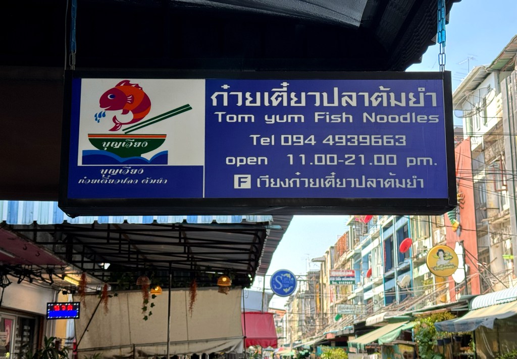
Despite living in Thailand for 7 years, I’ve never tried tom yum fish noodles. I love tom yum soup, but fish noodles? Are the noodles made of fish or just served with fish? Either way, I was drawn to this lovely blue lightbox—such a cute restaurant logo, and the Thai and English typefaces go really well together and I will definitely give it a try next time passing by.
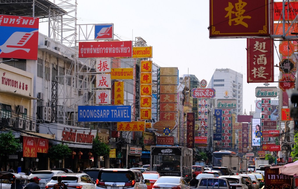
If we’re talking about signs, we can’t skip Yawarat Road — Bangkok’s Chinatown. Every shop is lined with signs, big and small, packed tightly together in a mix of Thai and traditional Chinese. It’s a colorful and vibrant scene, especially at night when all the neon lights up. A truly magical place — that is, if you don’t mind the busy traffic and constant flow of people.
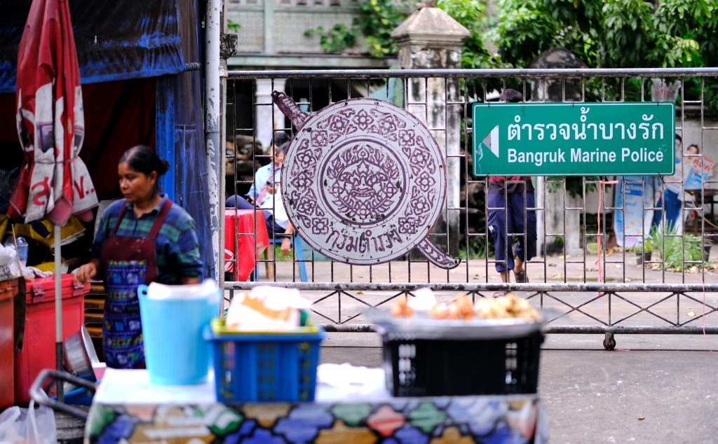
What a beautiful hand-drawn Royal Thai Police emblem, paired with a green directional sign using standard computer-printed letters. The contrast between the detailed artwork and the simple print makes it a fun and unexpected combo.